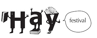
I'm working on re-branding 'Hay Festival'. It's not too far from where I live at home in mid-wales, so thought that it would be a nice project to do.
But it does make me laugh when people think that it's a festival about hay, hehe. It's an annual book festival, as the town is renowned for it's numerous book shops.
I did, initially, want to label it as not only a book festival, but for music and comedy also. Quite a few famous names and musicians attend and perform each year, which attract consumers who would not necessarily be souly interested in books.
But after trying to brand the festival as several different things, i thought that it may be too confusing for the potential / existing consumer. Afterall, we all know what has happened to Woolworths, who were trying to be everything under the sun.
So felt that it was best to stick with one strong message, that it is a book festival.
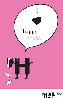
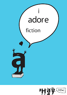
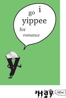
These ideas above, took influence from an image that i discovered from the 'Big Active' blog. Creating people and characters out of letters. This example would be aimed at children, to get them to want to attend the event and also to encourage them to want to read.
But, it's just an idea. Would need to develop and use appropriate colours, and also not quite happy with 'i go yippee for romance', i was getting desperate, haha.


2 comments:
Hey Nats,
I really like these!
I think it looks better when theres more than one of the little people letters at one time...theres a lot of space when its just one!
aww thanks charls!
they were really fun to do too :)
yeah, they were just initial ideas, do know what you mean though...they do look a bit blank on the individual ones! hope your work is going okay!
Post a Comment