Tuesday, 17 November 2009
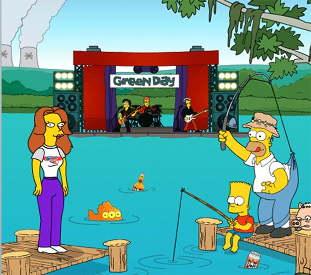
New cast member of The Simpsons.

Friday, 13 November 2009
LONDON.


I do love visiting the Capital. Don't get a chance very often, so always try to make the most of when I do. Having a browse along Oxford St, on a chilly November day. The Christmas lights were up too, a very lovely surprise. Hope to go back down there soon.

Advance

This is just a sample of some graphic work I've been doing. It's a flyer for 'Advance CPD', and what they used and handed out for the Legal Wales Conference 2009, held in Cardiff.
N & B Design
I've sort of gone into business with a good friend of mine, Beth Knight. Collectively, we're called
N & B Design (although we are trying to see if we can come up with another genius alternative name). Beth also graduated this year, gaining a degree in illustration.
We were invited to participate in a local Wedding Fayre, us providing the graphic design, wedding stationary side of things. Never to turn down a challenge, we accepted, as knew that opportunities like that don't come along very often.
So, in about 3-4 weeks, we'd come up with several designs for personalised wedding stationary, from invites, to order of service, from table names to thank you cards.


N & B Design (although we are trying to see if we can come up with another genius alternative name). Beth also graduated this year, gaining a degree in illustration.
We were invited to participate in a local Wedding Fayre, us providing the graphic design, wedding stationary side of things. Never to turn down a challenge, we accepted, as knew that opportunities like that don't come along very often.
So, in about 3-4 weeks, we'd come up with several designs for personalised wedding stationary, from invites, to order of service, from table names to thank you cards.


Poppet in context.
So, I had an idea, and a typeface created. Now to put it to some good use.
The font is aimed at chidren. I thought about the idea of creating an arrangement of the letters to spell out names. Above is the outcome. This ended up being a christening gift, put in a nice wooden frame, it is a lovely personalised present.

I did several of these framed name pictures. Each outcome unique & different from the previous.

The font is aimed at chidren. I thought about the idea of creating an arrangement of the letters to spell out names.
 Above is the outcome. This ended up being a christening gift, put in a nice wooden frame, it is a lovely personalised present.
I did several of these framed name pictures. Each outcome unique & different from the previous.

Poppet.

Typeface - Poppet.
A fun font that is aimed primarily at children. Giving each letter a 'personality' and 'character' by having them enjoy a childhood activity.
For the moment, this is purely decorative, and an experiment really. I will need to develop further, in order to perhaps make it of educational use for a child.
Subscribe to:
Posts (Atom)

 Posts
Posts